Web Design
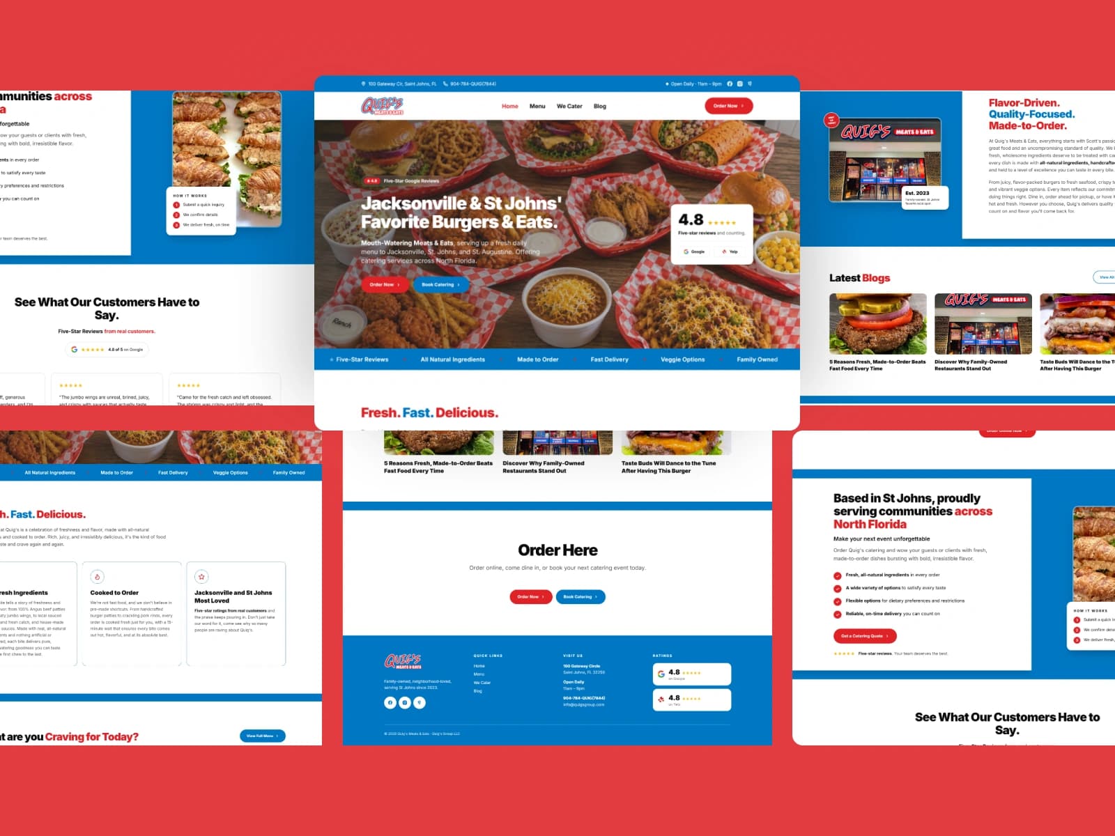
Quig's Meats & Eats
Brand identity and website design for a scratch kitchen serving burgers, tenders, and catering in St. Johns, Florida.
View case study
Brand identity design for Fernandina Beach businesses that need more than a logo in a folder: a mark that holds at favicon size and on a storefront sign, a type system, a palette tested in one colour, and guidelines that keep it all consistent after I hand it over.
I uncover your mission, audience, and market position. This clarity becomes the backbone of your brand identity.
I create a visual direction with mood boards and references that defines the tone, style, and creative direction.
From logos to color and typography, I develop a cohesive system built around your goals and story.
You receive a complete, ready-to-use brand identity with guidelines and assets to confidently apply it across your business.
Perfect for new businesses needing a visual foundation.
Timeline: 1–2 weeks
Ideal for growing businesses ready for a cohesive brand system.
Timeline: 3–4 weeks
For established brands needing a full-scale, polished identity.
Timeline: 5–7 weeks
Fernandina Beach has a look people remember. Its downtown historic district has been on the National Register since 1973, and its buildings lean Victorian and frame vernacular. Centre Street runs eight blocks down to the harbor, lined with independent shops selling local art, handmade crafts, fashion and antiques. A brand here sits beside all of that history, so it needs a clear voice of its own rather than borrowed period detail.
That shapes how I design an identity for a Fernandina Beach business. I test the mark small and large, on a hanging sign, a shopping bag and a phone screen, because a visitor might see all three in one afternoon. I build a palette that still reads in one colour and on dark, and a type system that handles a chalkboard menu line as comfortably as a website headline.
Amelia Island also runs on hospitality. Several of the island’s historic homes and Victorian mansions now operate as bed and breakfasts, and the dining ranges from fresh seafood to fine dining. For businesses like these, the identity lives on room cards, menus, gift cards and booking pages. I deliver guidelines and production-ready files so every one of those pieces stays consistent once the project ends.
Brand identity and website design for a scratch kitchen serving burgers, tenders, and catering in St. Johns, Florida.
View case study
A full rebrand and website for Balance Brightness, an accounting coaching and training brand helping professionals across Lebanon master the practice and pass their exams.
View case study
Brand identity, website, and SEO for Class, Race & Corporate Power, a political journal publishing work for activists, scholars, and community organizers.
View case study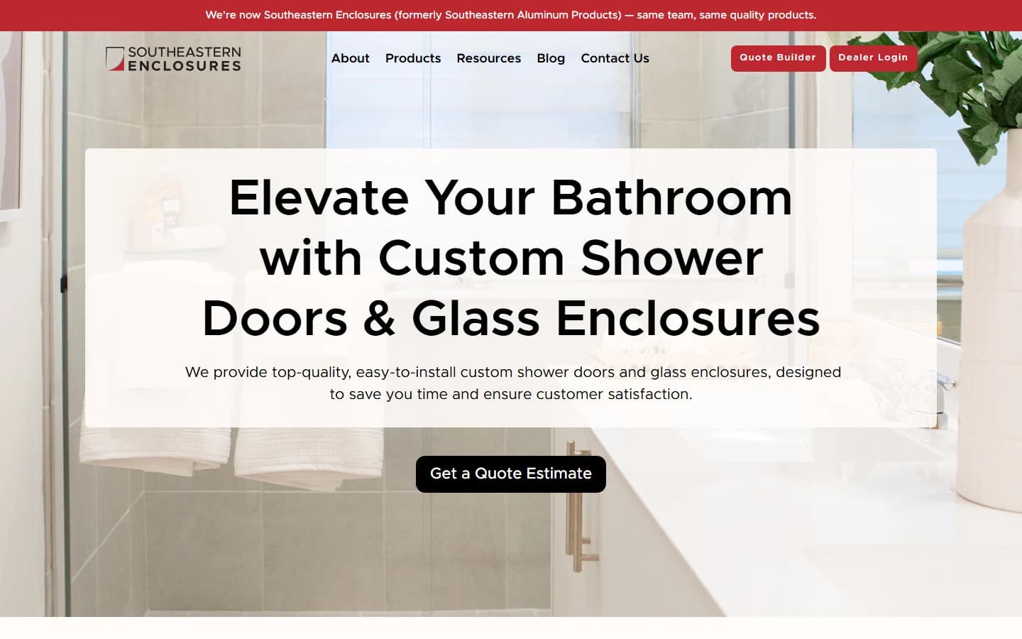
Brand identity and website design for a Jacksonville shower door and glass enclosure manufacturer, from a new logo through a full product website built for the contractors and installers who buy from them.
View case study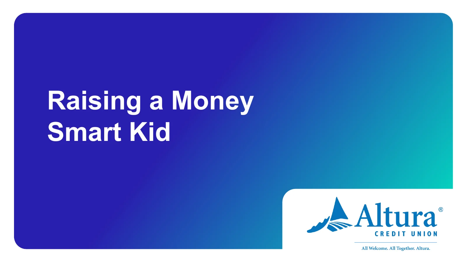
Workshop presentation and handout design for Balanced Financial Wellness, turning dense financial education into clear, approachable slides for credit union members.
View case study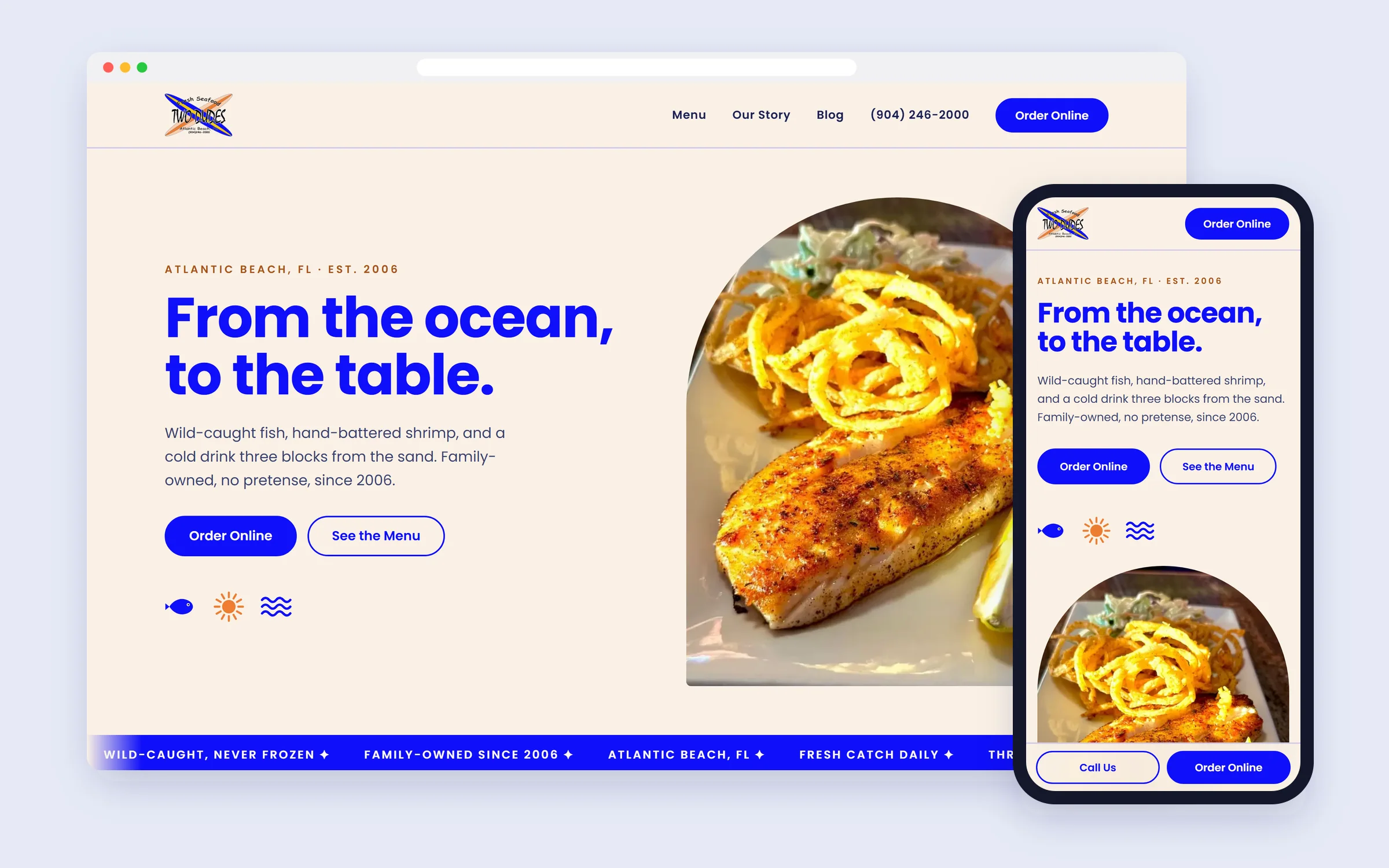
Website design for a family-owned seafood restaurant in Atlantic Beach, Florida, a laid-back coastal site built to turn hungry visitors into online orders and walk-ins.
View case study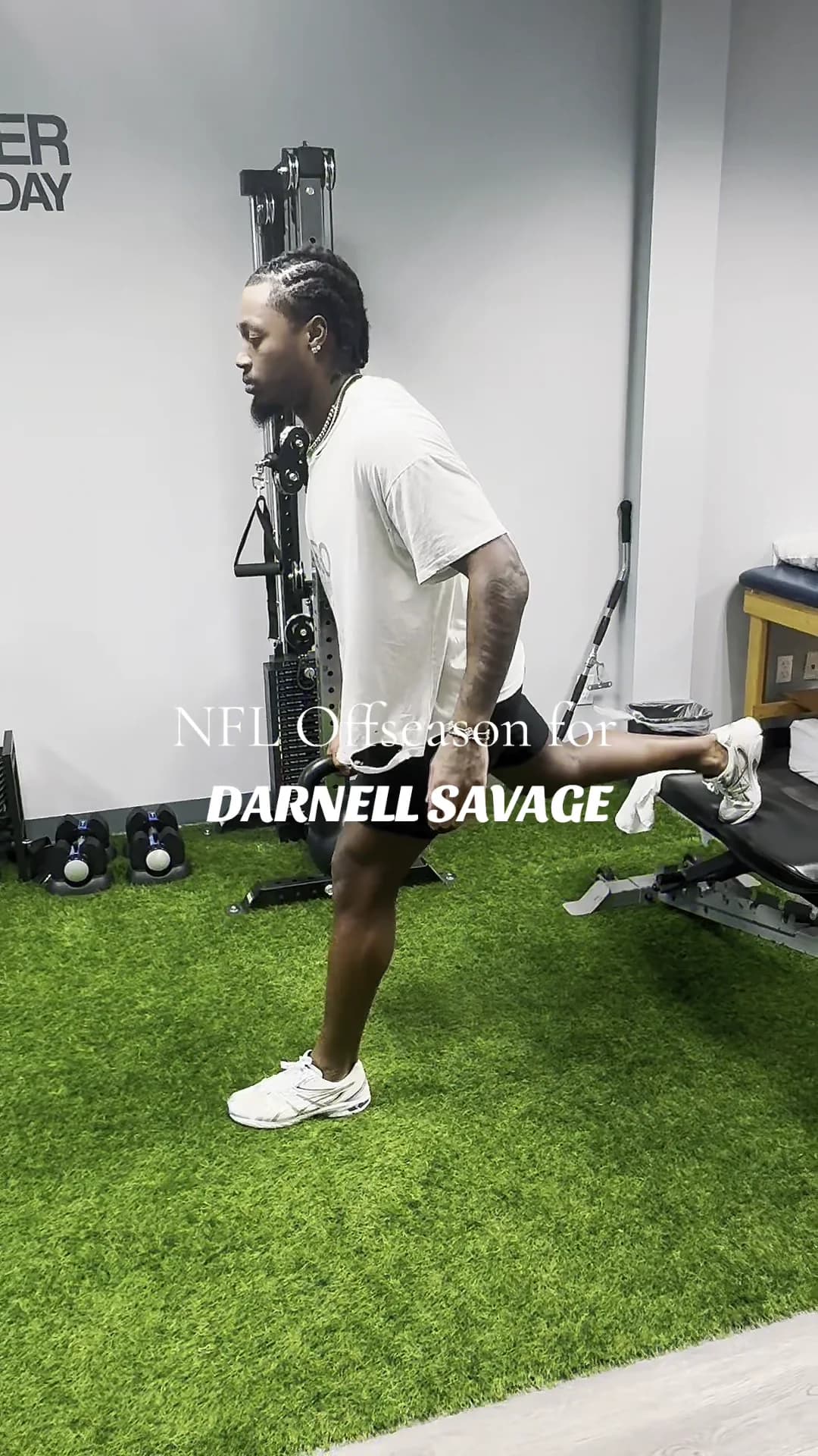
Short-form social content for Rebound Rehabilitation, filming, editing, and posting reels that turn a physical therapy clinic's day-to-day into scroll-stopping Instagram and TikTok.
View case study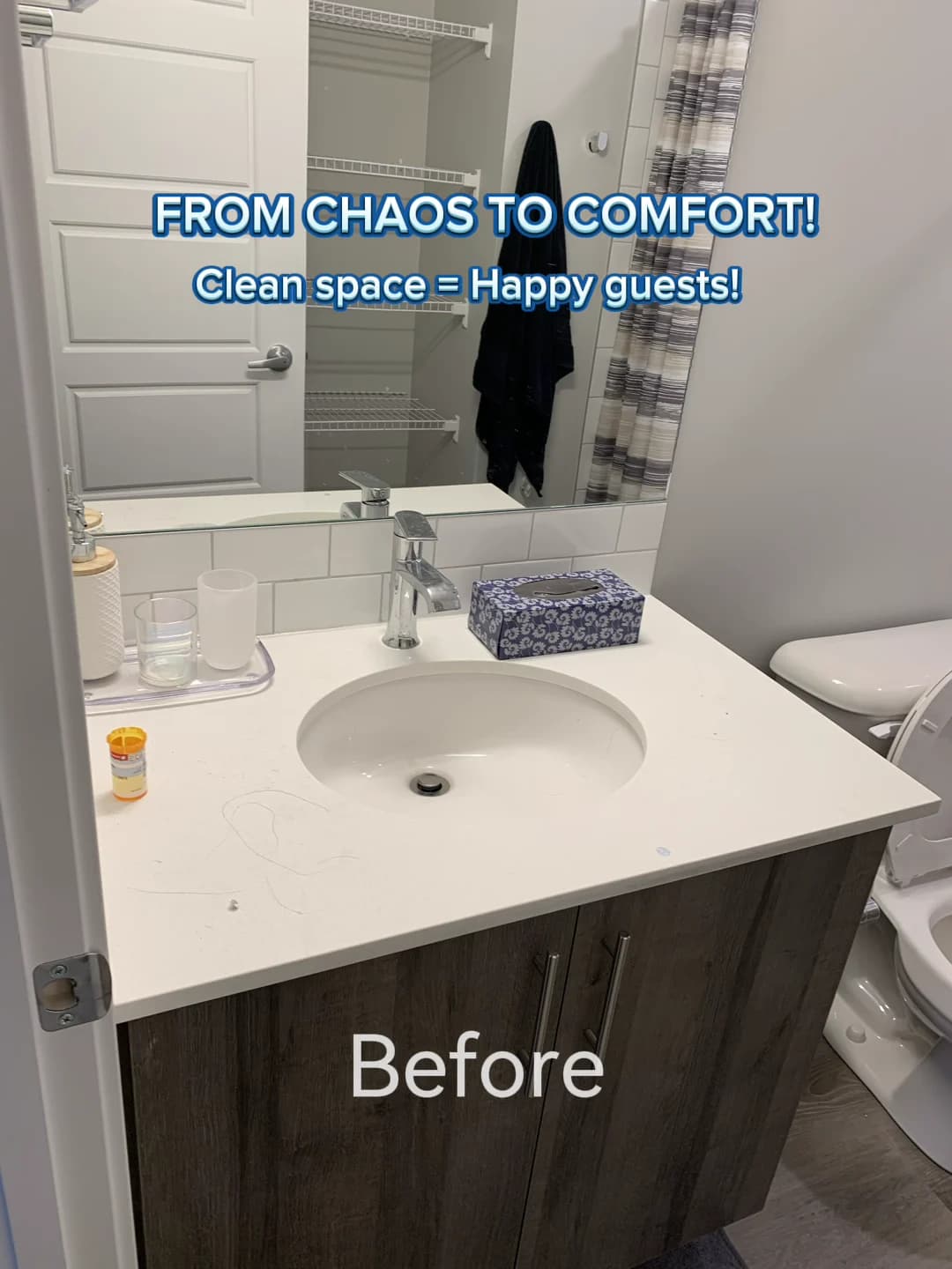
Social media design and content produced at Allora Marketing, branded posts, carousels, and reels for clients including Taste of Italy Calgary and Desired Cleaning.
View case study
Literature and Code is the next generation software development company that brings principles from the past to the future through writing timeless code that will live on for generations.
View case study
Skinhance is a skincare company whose aim is to empower individuals to enhance the natural beauty of their skin.
View case study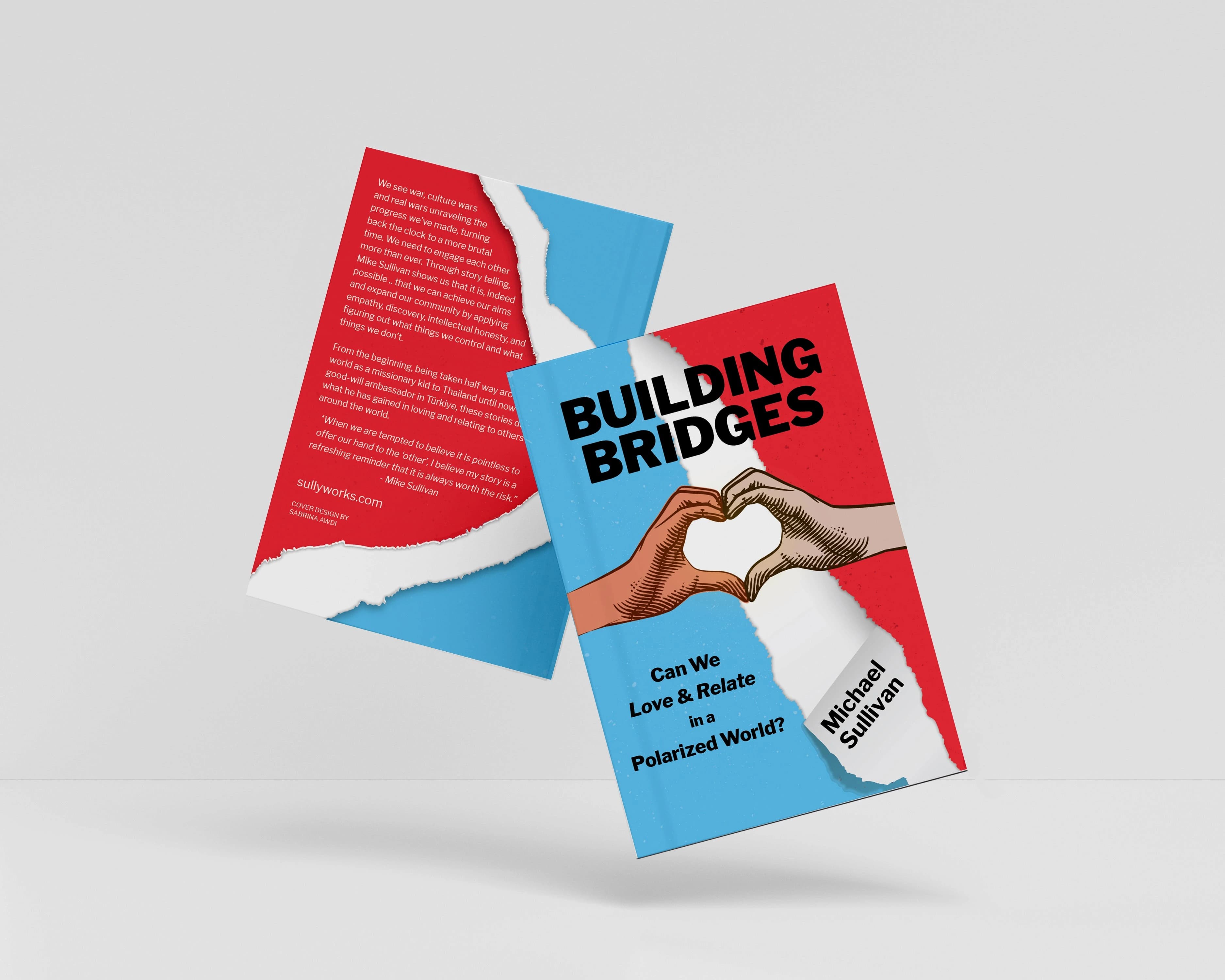
Book cover design for Michael Sullivan's 'Building Bridges: Can We Love & Relate in a Polarized World?' A cover built to capture the book's heart and stop a reader mid-scroll.
View case study
Aflore is a beauty salon based in Bucharest, Romania which exudes femininity and sophistication.
View case study
Branding for a beauty salon in Macomb, Michigan which personifies sophistication, femininity, elegance, luxury, and tranquility.
View case study
Branding and UI design for a concept application called Wander, meant for travelers who like to discover things related to what they love in their areas.
View case study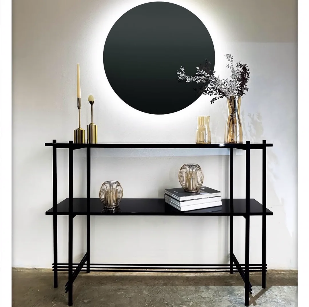
Brand identity redesign, social media, and video editing for Tannous Group, a furniture and interior design house. A refined TG identity and sub-brand system, applied across products, uniforms, and a family of Instagram feeds.
View case study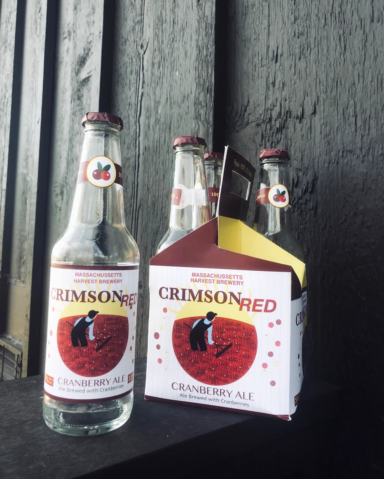
A self-directed packaging concept for Crimson Red, a cranberry ale inspired by the annual Massachusetts cranberry harvest. I designed and illustrated everything, from the folk-art harvesting illustration to the label, four-pack carrier, and mockups.
View case study
A 2D motion piece that gleefully breaks every rule in the graphic-design handbook, clashing grids, warped type, and intentional chaos.
View case study
My RIT 3D motion final: the synthwave aesthetic dropped into deep space, built entirely from abstract elements: a rippling sea, planets and a moon, a rainbow diamond, and, at the end, a lone skull.
View case study
A re-imagined 3D title sequence for the action-comedy film 'The Spy Who Dumped Me', where romance and espionage collide in glossy, candy-red typography.
View case study
A fictional user interface (FUI) concept: a heads-up scanner that locks onto the person in front of you and reads them in real time.
View case studyI design brand identity systems for businesses in other First Coast towns too. Pick the area closest to you.
Identity systems for Fernandina Beach shops, inns and eateries, made to stand out in a Victorian downtown.
A complete identity, not just a logo. For a Fernandina Beach business I design a logo suite with a primary mark, a secondary mark and a submark that holds at favicon size, a type hierarchy, a colour palette tested in one colour and on dark, brand guidelines, and production-ready files for print, screen, packaging and social. The exact scope depends on the package you choose.
Most new Fernandina Beach businesses are well served by the Starter Brand Kit: one or two logo concepts, a round of refinements, a curated palette, a typography pairing and a basic brand guide, in 1 to 2 weeks. If you already trade on Amelia Island and need a fuller system with a submark, brand patterns and social assets, the Brand Identity Suite is usually the better fit.
It depends on the package. The Starter Brand Kit runs 1 to 2 weeks, the Brand Identity Suite 3 to 4 weeks, and the Full Brand System 5 to 7 weeks. Those ranges apply to Fernandina Beach clients exactly as they do anywhere else, because the work happens over email and shared files rather than depending on travel.
Yes, and that balance is most of the job. Fernandina Beach has real history to draw on, from its Victorian downtown to its place as the birthplace of the modern shrimp-fishing industry. I use that as context, not costume: a type choice or colour that nods to the setting, paired with a clean mark that still reads on a phone screen and a small social avatar.
That is what the system is built for. Before I hand over a Fernandina Beach identity, I test it in real applications: a storefront sign, a menu, a label, a social post. The palette is checked in one colour and on dark, and you get production-ready files for print, screen, packaging and social, so a printer or sign maker can use them without guessing.
Yes. Plenty of businesses have a logo but no system around it, so the menu, website and Instagram each look slightly different. If your Fernandina Beach business is in that spot, I can refine what you have or rebuild it, then document it in guidelines covering spacing, colour, type and misuse, so you look like one brand on Centre Street and online.
Tell me a little about your brand and your goals. I'll get back to you to talk through how we can work together.