
Web Design
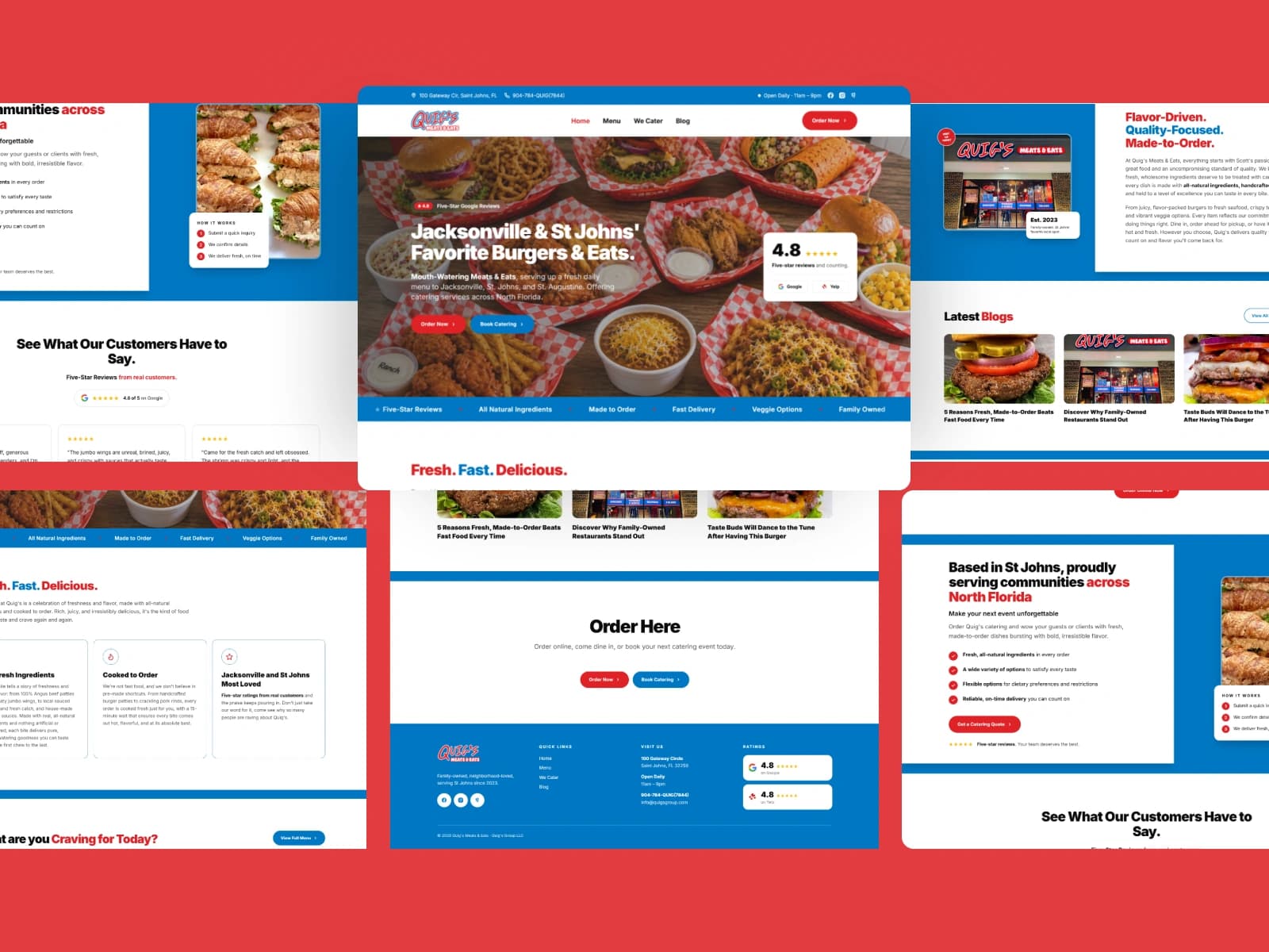
Quig's Meats & Eats
Brand identity and website design for a scratch kitchen serving burgers, tenders, and catering in St. Johns, Florida.
View case study
I’m Sabrina Awdi, a brand and web designer for women-owned businesses, and a graphic designer for Fernandina Beach companies, based in Jacksonville. I design brand identities, websites and marketing for the shops, inns, restaurants and service firms of Amelia Island, so the brand a visitor meets on Centre Street matches the one they find online.
A logo is the easy part. The harder part is everything it has to live on: a hanging sign on a Victorian storefront, a menu, a room card at an island inn, an Instagram grid, and the booking page a visitor opens on their phone. When those pieces drift apart, one business starts to look like several. I design the whole system, so your Fernandina Beach brand reads as the same business everywhere it appears, in print and on screen.
An identity system that:
Four services, one consistent brand. Each one is shaped around what a Fernandina Beach business needs, from the sign by the door to the page a visitor finds in search.
Identity systems, packaging, book covers and websites for brands in beauty, food and beverage, software, publishing and professional services. A Fernandina Beach project gets the same process and the same care.
Brand identity and website design for a scratch kitchen serving burgers, tenders, and catering in St. Johns, Florida.
View case study
A full rebrand and website for Balance Brightness, an accounting coaching and training brand helping professionals across Lebanon master the practice and pass their exams.
View case study
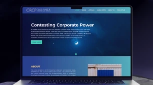
Brand identity, website, and SEO for Class, Race & Corporate Power, a political journal publishing work for activists, scholars, and community organizers.
View case study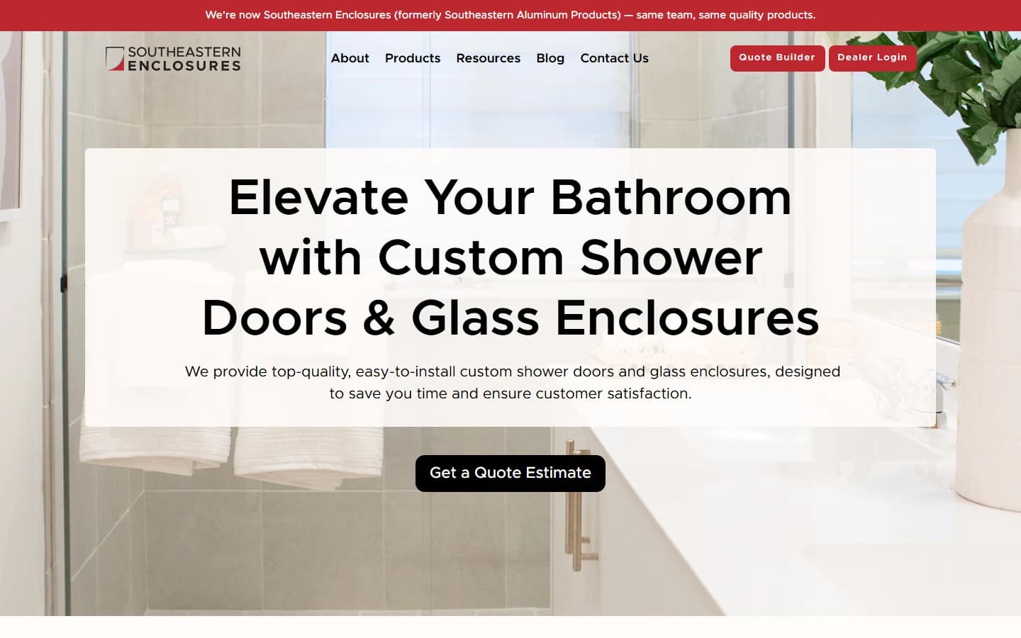
Brand identity and website design for a Jacksonville shower door and glass enclosure manufacturer, from a new logo through a full product website built for the contractors and installers who buy from them.
View case study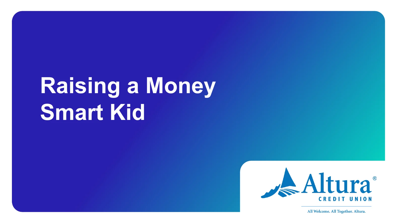
Workshop presentation and handout design for Balanced Financial Wellness, turning dense financial education into clear, approachable slides for credit union members.
View case study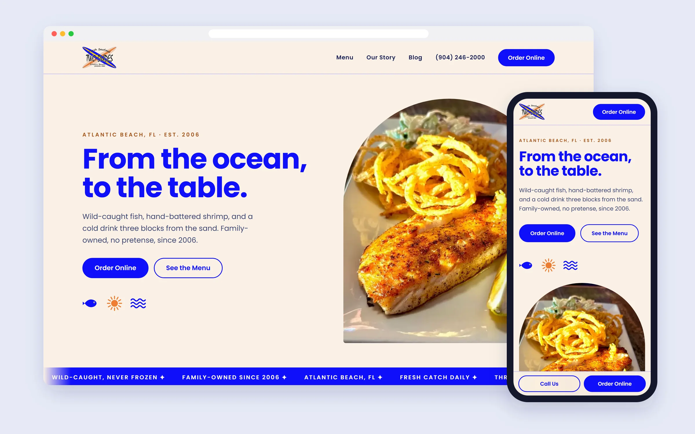
Website design for a family-owned seafood restaurant in Atlantic Beach, Florida, a laid-back coastal site built to turn hungry visitors into online orders and walk-ins.
View case study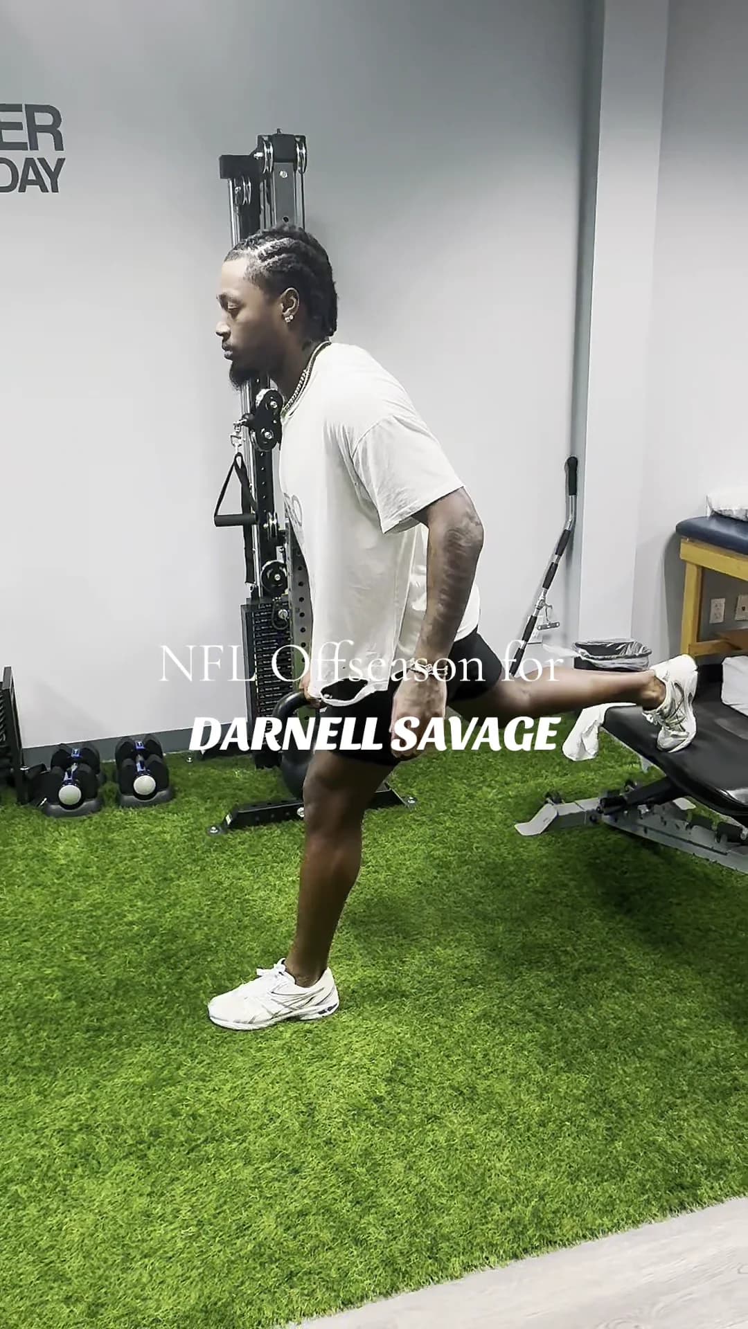
Short-form social content for Rebound Rehabilitation, filming, editing, and posting reels that turn a physical therapy clinic's day-to-day into scroll-stopping Instagram and TikTok.
View case study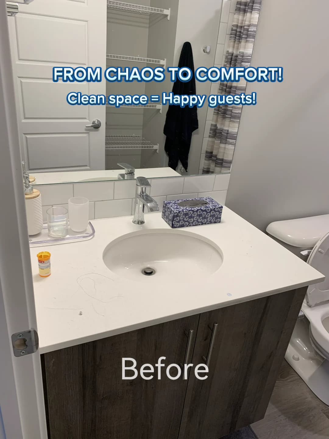
Social media design and content produced at Allora Marketing, branded posts, carousels, and reels for clients including Taste of Italy Calgary and Desired Cleaning.
View case study
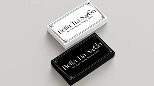
Brand identity for Bella Tia, a beauty salon in Macomb, Michigan, balancing luxury and elegance with a sense of calm.
View case study
Branding and UI design for Wander, a concept travel app for discovering places around a traveller's own interests.
View case study
Brand identity for Aflore, a beauty salon in Bucharest, Romania, built around femininity, sophistication, and restraint.
View case study
Brand identity and packaging system for Skinhance, a skincare company built around simplicity, care, and visible results.
View case study
Brand identity and web design for Literature & Code, the first Bitcoin-only software company in the Middle East, built on a minimalist visual system that reworks the Renaissance for modern software.
View case study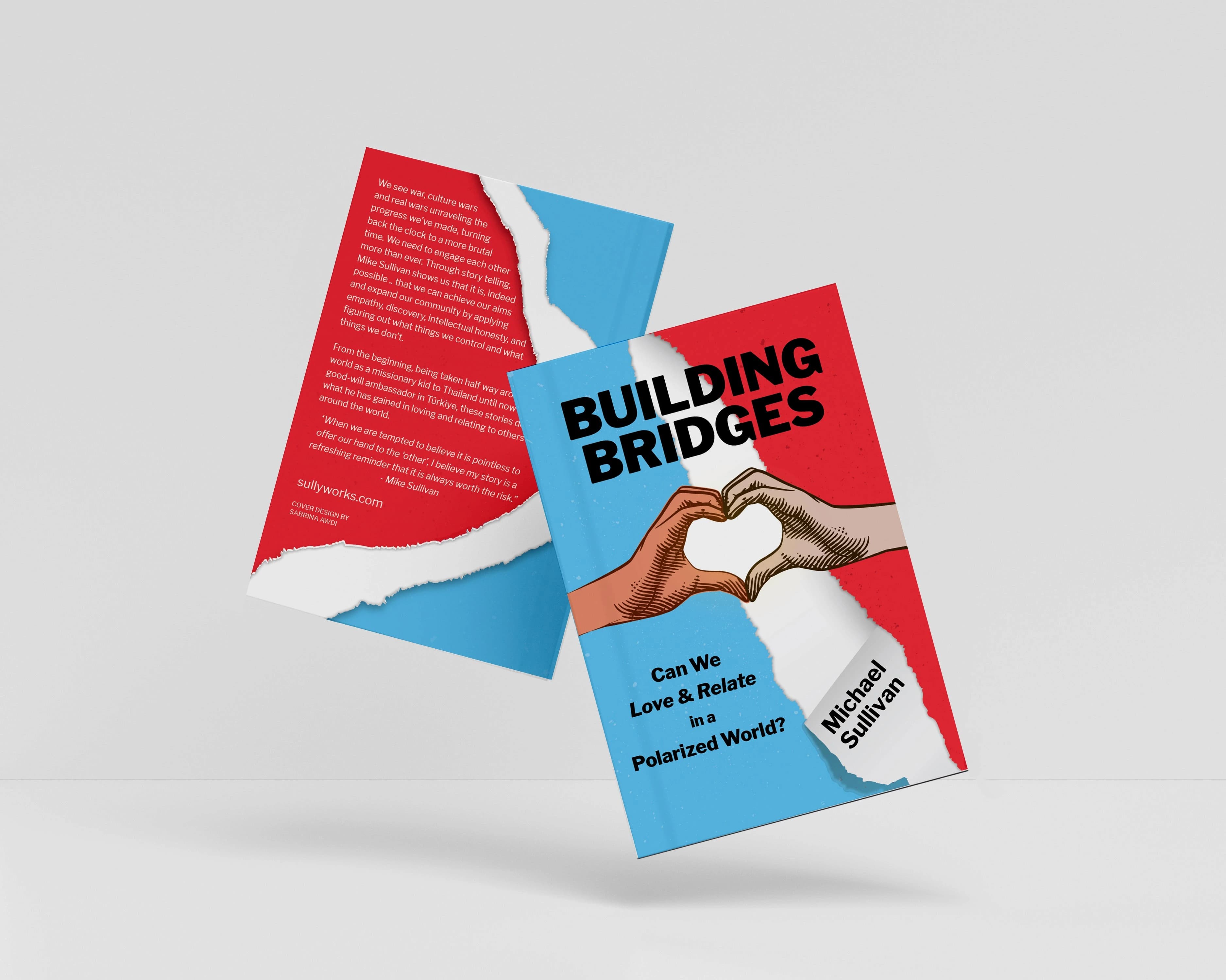
Book cover design for Michael Sullivan's 'Building Bridges: Can We Love & Relate in a Polarized World?' A cover built to capture the book's heart and stop a reader mid-scroll.
View case study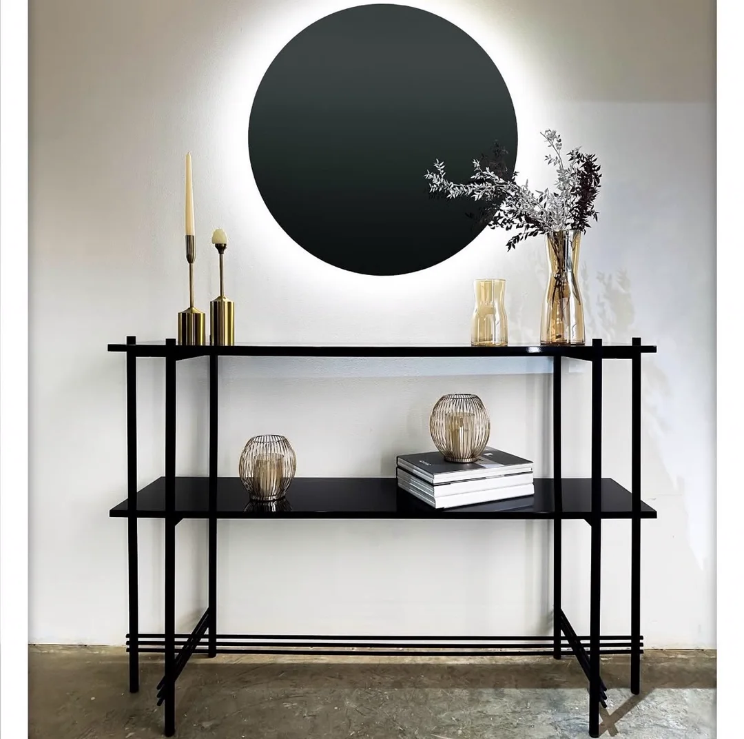
Brand identity redesign, social media, and video editing for Tannous Group, a furniture and interior design house. A refined TG identity and sub-brand system, applied across products, uniforms, and a family of Instagram feeds.
View case study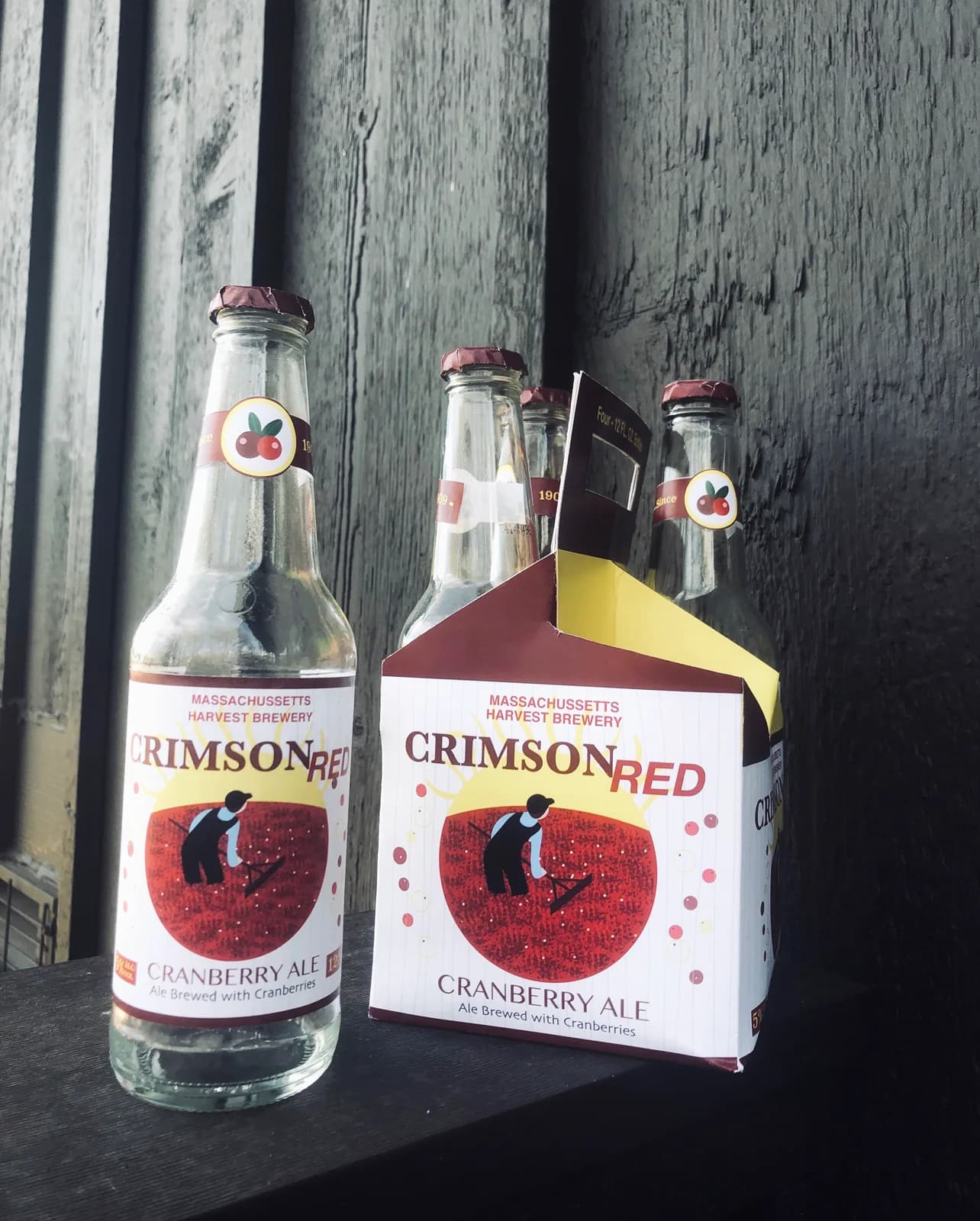
A self-directed packaging concept for Crimson Red, a cranberry ale inspired by the annual Massachusetts cranberry harvest. I designed and illustrated everything, from the folk-art harvesting illustration to the label, four-pack carrier, and mockups.
View case study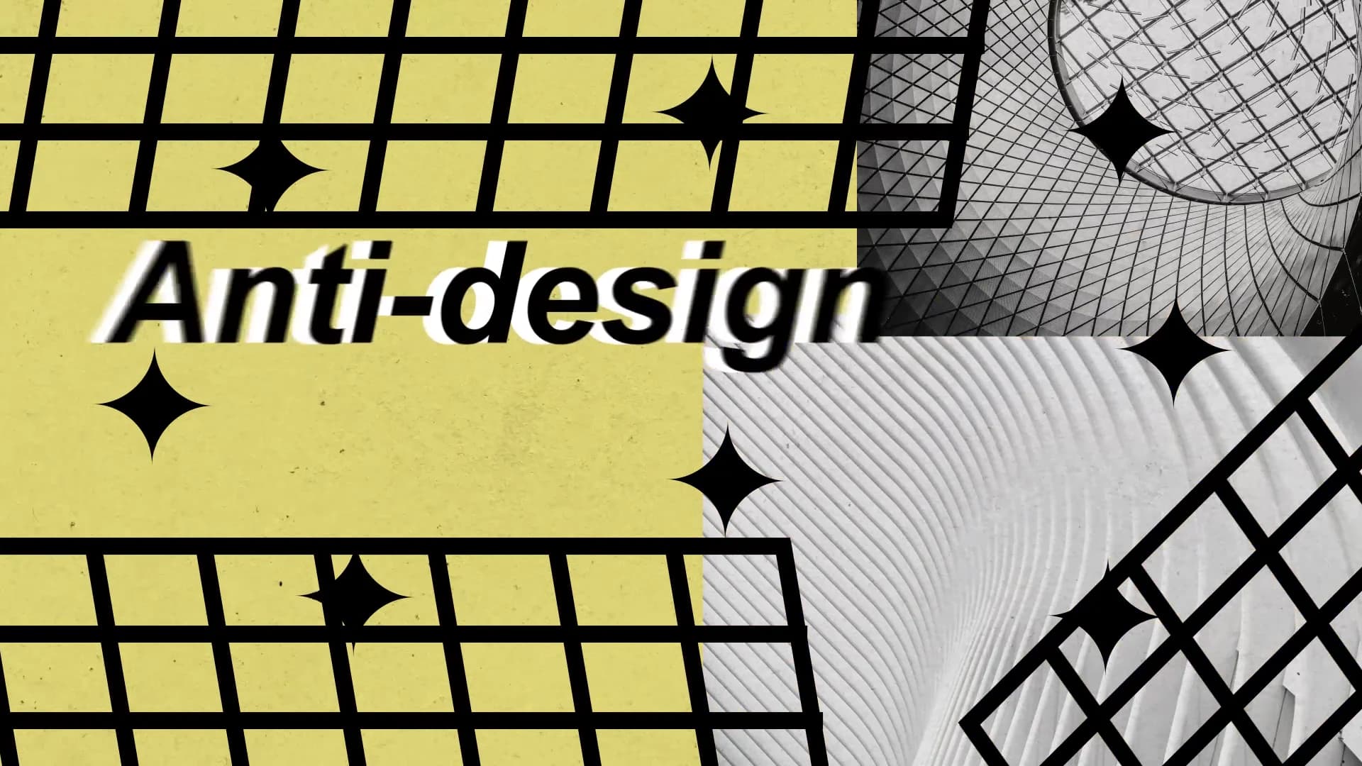
A 2D motion piece that gleefully breaks every rule in the graphic-design handbook, clashing grids, warped type, and intentional chaos.
View case study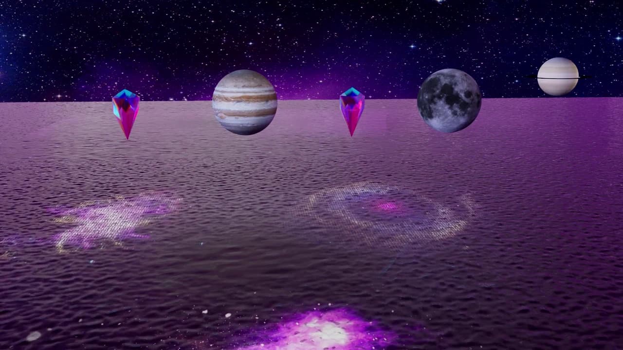
My RIT 3D motion final: the synthwave aesthetic dropped into deep space, built entirely from abstract elements: a rippling sea, planets and a moon, a rainbow diamond, and, at the end, a lone skull.
View case study
A re-imagined 3D title sequence for the action-comedy film 'The Spy Who Dumped Me', where romance and espionage collide in glossy, candy-red typography.
View case study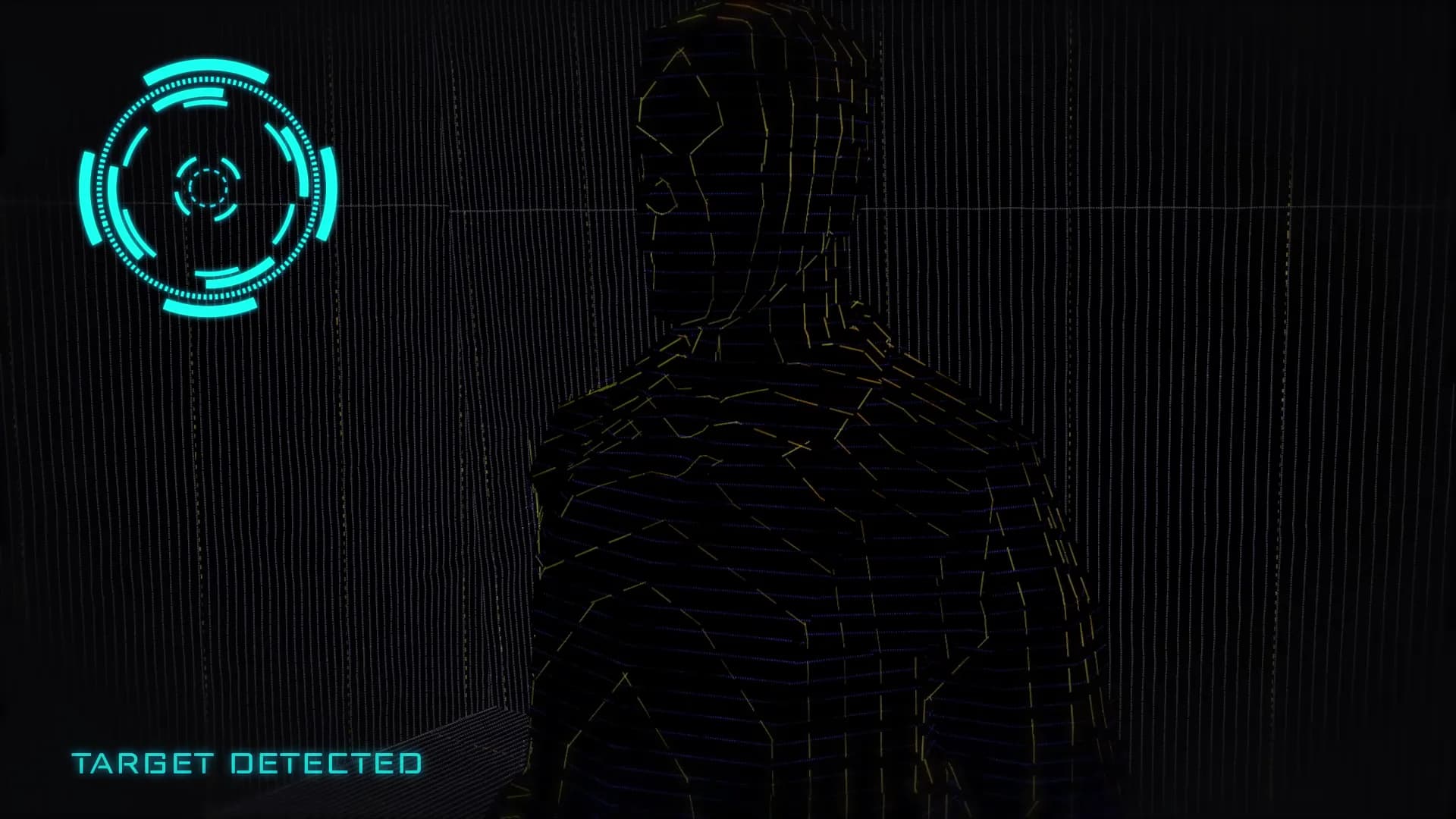
A fictional user interface (FUI) concept: a heads-up scanner that locks onto the person in front of you and reads them in real time.
View case studySabrina has shown to be a competent designer with a keen eye even on the smallest details. She has shown high levels of professionalism and work ethic, and was able to get the designs done in a fast manner. I would recommend working with her on building your brand identity and web design for your business.
I am immensely grateful for Sabrina's exceptional talent and deep understanding of my vision. Her professionalism and efficient communication made the collaboration seamless. I wholeheartedly recommend her services to anyone seeking professional and creative design. Thank you, Sabrina, for your invaluable contribution.
Sabrina provided me with an amazing book cover. She has successfully catapulted my book into the hands of people willing to pay money for it. She was easy to work with and paid attention to the details necessary to send the right message to my audience. I highly recommend her to others looking to grow their brand.
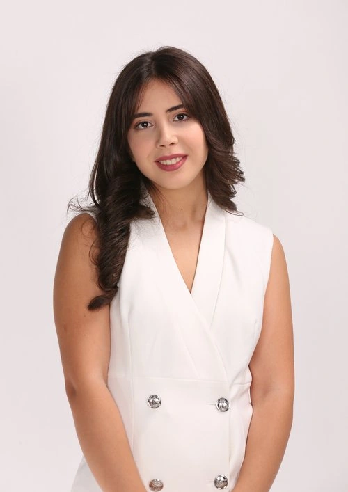
I’m Sabrina Awdi, a graphic and brand designer based in Jacksonville with over 4 years of global experience. I’ve built visual identity systems for brands in beauty, food and beverage, software, publishing and professional services, for clients across the US, Europe and the Middle East. With a Fernandina Beach business I work the same way: a clear brief by email, research before sketches, and a finished system with guidelines and production files you can hand to any printer, sign maker or developer.
Research, references, and the problem the design has to solve.
Sketches and routes explored broadly before anything gets refined.
Type, colour, and layout resolved into a system that holds together.
Production-ready files, guidelines, and everything needed to use them.
Fernandina Beach is the northernmost city on Florida’s Atlantic coast and the county seat of Nassau County, set on Amelia Island about 25 miles northeast of downtown Jacksonville. It was the last town platted under Spain’s Laws of the Indies, named for King Ferdinand VII, and the island is known as the Isle of Eight Flags. History is part of the brand of the place.
Downtown is where that shows. The historic district, on the National Register since 1973, holds around 300 buildings in mostly Victorian and frame vernacular styles. Centre Street runs eight blocks to the harbor, with pubs, restaurants, gift shops, art galleries, antiques and consignment stores. Businesses here compete for attention in a setting that already looks good, so their own design has to hold its ground.
The island also runs on visitors. Amelia Island promotes 13 miles of beaches, golf, dining and shopping, and several Victorian mansions now operate as bed and breakfasts. Fernandina Beach is also considered the birthplace of the modern shrimp-fishing industry, which the Isle of Eight Flags Shrimp Festival celebrates each May. Good design here has to work for locals and first-time visitors alike.
Fernandina Beach is one of the Northeast Florida areas I serve from my base in Jacksonville. Choose an area to see the services I offer there.
Brand, web and SEO work for Centre Street shops, island inns and restaurants on Amelia Island.
Yes. Fernandina Beach is one of the Northeast Florida areas I serve, about 25 miles northeast of downtown Jacksonville. Most of my work already happens remotely, with clients across the US, Europe and the Middle East, so a Fernandina Beach project runs the same way: a clear brief by email, shared drafts to review, and organised, production-ready files at the end.
I design brand identity systems, websites and the marketing that carries them, plus packaging, book covers, editorial layout and motion graphics. For a Fernandina Beach business that usually means a logo suite and guidelines, a website that matches the storefront, and social and print pieces that look like they came from the same hand. I also offer SEO, so the new site gets found.
I start with the setting your customers actually see. Fernandina Beach’s downtown historic district is built largely in Victorian and frame vernacular styles, so a brand there needs to sit comfortably beside old brick and painted wood without looking like a costume. I look for type, colour and a mark that respect that character while still reading clearly on a phone screen.
Yes. Amelia Island draws visitors with its beaches, golf, dining and shopping, and the Isle of Eight Flags Shrimp Festival alone attracts more than 135,000 people. A visitor often meets a Fernandina Beach business online first, then in person. I design both moments together, so the website, the social posts and the sign on the door tell the same story to someone who has never been in before.
It starts with an email. You tell me about your Fernandina Beach business: what you sell, who buys it, and what is not working with how you look today. I reply with questions, then a written scope that lists what I will design and deliver. Once we agree on it, I begin with research and a visual direction before any logo is drawn.
Yes. Plenty of Fernandina Beach businesses still lean on print: menus, rack cards, packaging, signage files and gift shop labels sit alongside the website and Instagram. I design identity systems to work in both, with production-ready files for print, screen, packaging and social, and a palette tested in one colour so it holds up on a printed label as well as on a screen.
Tell me about your Fernandina Beach business and what you want it to look like. I’ll reply by email with a few questions and the next steps.